What’s wrong with this vintage Rolex?
Recently, I’ve gotten a lot of questions about the vintage Rolex Air-King. I don’t know, maybe because more popular sports watches are so expensive people are looking elsewhere to start or build a vintage Rolex collection. Or, someone stumbles on my SEO-optimized reference article and thinks I’m qualified to talk about the model. It’s funny, there are dozens (hundreds) of your standard-issue silver dial Air-Kings on eBay and Chrono24 at any given moment. But usually, it’s the rare or seemingly special variations that catch the interest of collectors. This eBay atrocity still sticks out as one of the worst I’ve been sent.
This week, I was sent another ref. 5500 up for sale at a real, live, sorta-big auction house on Feb. 15. The low estimate suggests the auction house knows it’s a sh*t watch ($1.2k for a blue dial Air-King is well below the market), but good luck finding any hint of that in the condition report. So, I thought it’d be fun to do a quick exercise: let’s look at the watch close-up (focused on the dial) and see what’s wrong with it. For comparison, we’ll use an original, correct Air-King ref. 5500 previously sold by the Hodinkee Shop.1 I sit firmly in the teach a man how to fish school of thinking, so perhaps this’ll serve as useful guidance in evaluating other vintage watches (Air-King or not).
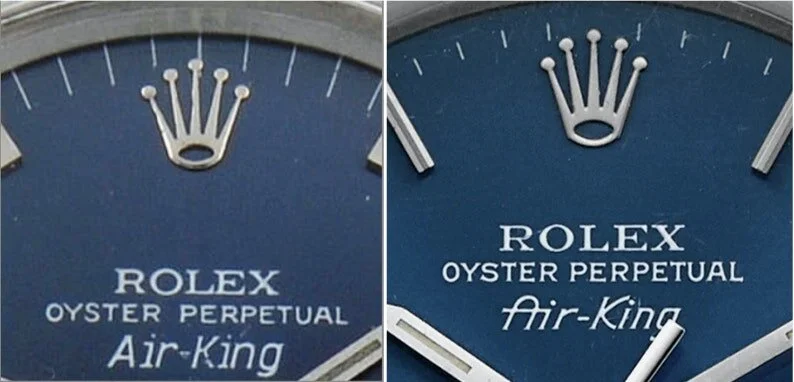
(L) Bad Air-King, at auction this week; (R) Good Air-King
Like I said, this watch is pretty clearly wrong in almost every way, but it’s helpful to look at an egregious offender for guidance in evaluating better re-dials, frankens, or fakes. At first glance, you’ll probably immediately notice the mis-sized hour markers, chode-like compared to the long, elegant markers of the correct Air-King on the right.
Second, you might notice on the re-dialed example that there’s no signature under 6 o’clock. Typically, a Rolex dial will have a signature, which helps to indicate the era it’s from, also giving a clue as to the type of luminous material used (Rolex Passion Report’s article on lume provides helpful guidance on the signature to look for).
Finally, take a look at the differing seconds tracks. The re-dialed example has uneven lines that also extend all the way to the edge of the dial while the correct dial has clean, even ticks that stop short of the dial’s edge.
(L) Redial; (R) Correct dial
Now, take a look at the Rolex crown. Most noticeably, the re-dial’s crown isn’t even aligned with the center 60-second marker (in fact, the original dial doesn’t have a hash mark at 12 o’clock). Also note the differences in the crown shape, best seen by looking at the different shapes of the circle at the crown’s bottom.
Next the Rolex print: notice how the correct print utilizes different weights (for example, the two different lines of the X). The re-dial makes no effort to do this, or it’s sloppily done.
On the middle line of text, notice that the Oyster Perpetual on the re-dialed example lacks the slight serif seen on the correct dial. The Air-King print on the final line is perhaps the most obviously off, in particular the A, which lacks the crossbar connecting it to the i.
(L) Redial; (R) Correct dial
Finally, at 6 o’clock: doesn’t the Precision print on the re-dial just look a little sloppy compared to the original dial? It’s crooked and the spacing is off, stumbling across the dial like a college student that just discovered two-buck chuck. This is like a lot of the text you’ll see on re-dials: zoom in and you’ll see it all looks a little off.
Is this boring? Hell no! It’s a scavenger hunt, picking up little clues and details that can give away a re-dial or fake vintage watch from the real thing. While this example has a lot wrong with it, other re-dials may only have one or two clues. Of course, there’s work to be done in examining the movement, case, serial and reference numbers too, but often the dial has some of the most obvious giveaways. Happy hunting, and stay safe out there.


